Watches Try On UX WooCommerce: Design Patterns, CTA Placement & PDP Conversion Best Practices
Implement a prominent, one‑tap “Try on your wrist” CTA near price/Add to Cart to reduce uncertainty and lift PDP conversion.
Prefer a link‑based, zero‑code VTO for fast experiments (e.g., shareable links from tryitonme.com) or SDKs if you need deep customization.
Provide immediate fallbacks (upload photo, model previews, GIFs) and track Try‑on CTR, engagement time, and try‑on → add‑to‑cart.
faq”>FAQ
Introduction — why this guide matters
You’re focused on improving watches try on ux woocommerce — this guide lays out practical UX patterns, exact CTA placement, microcopy you can paste, fallbacks, and a zero‑code implementation path using a shareable VTO link like tryitonme.com.
Watches are high‑touch purchases: shoppers worry about case size, scale on the wrist, and finish. Adding a friction‑free virtual try‑on reduces that uncertainty and helps you convert hesitant buyers — see a brand example that describes how AR try‑on can reduce shopper doubt: Formex AR try‑on. Short practical examples of VTO benefits are summarized here: Try‑on tool examples.
Problem statement — Why VTO matters for watches
When customers can’t see how a watch sits on their wrist, they pause or leave — that’s the core UX problem you need to solve with watches try on ux. For watches specifically shoppers ask: does the case fit my wrist? does the watch look proportionate? how will the metal and finish read in real life?
Target metrics to track when you add VTO
PDP bounce rate
Try‑on CTA click‑through rate (Try‑on CTR)
Try‑on engagement time
Try‑on → add‑to‑cart conversion
These KPIs indicate whether your virtual try‑on is reducing uncertainty and driving purchases. For context on VTO business benefits and examples, see vendor writeups and brand examples: VTO benefits and Formex case.
Quick overview of VTO approaches (SDK/API vs link‑based)
There are two common approaches: SDK/API integrations (deep control, higher effort) and link‑based/no‑code VTO (fast to deploy, lower engineering requirements).
Typical SDK/API integrations — tradeoffs
Many VTO solutions are delivered as SDKs or APIs that require engineering time, server configuration, and platform maintenance. That approach gives deep customization but creates engineering backlog and ongoing maintenance (integration, auth, versioning) — see WooCommerce VTO guides for context: Webkul guide. You should also consider potential platform lock‑in or plugin compatibility issues; an overview of plugin landscapes is available here: WordPress plugin overview.
Link‑based / no‑code VTO — why many merchants prefer it
Link‑based VTO uses a shareable product link that opens the try‑on experience in a modal or new tab — no SDK, no complex integration. Benefits include fast time‑to‑market for marketing experiments (example benefits), cross‑channel deployment (email, social, product page) without extra engineering (implementation guide), and easy tracking via URL params and UTM tags.
Pros / Cons (short):
SDK/API: high control, high effort, deeper data hooks.
Link‑based: low effort, fast rollout, slightly less fine‑grained control — often the best early return for WooCommerce merchants. See a practical guide: Cermin guide.
Why tryitonme.com is the Right Fit for Your Business
Zero‑code, link‑based deployment — add a shareable try‑on link to any web, mobile, or social channel: tryitonme.com and overview: tryitonme on Cermin.
Fast delivery — unique, production‑ready try‑on links in under 3 business days (product information — client provided).
AR processing handled by tryitonme team/AI — you supply standard product photos and the team prepares assets.
Accurate accessory VTO tuned for watches; built for speed and cross‑channel sharing.
Make the CTA obvious but not intrusive — visible near price without covering product images.
Minimize steps — launch the try‑on session in one tap/click (no signup).
Give clear camera instructions — “Hold wrist flat; face camera toward wrist.” Simple calibration improves results. See watch AR notes: Formex AR and watch reflection notes.
Provide contextual prompts — if customer selects strap/metal variants, show a prompt “Try this strap”.
Respect privacy — explain camera use before permission prompt; offer an upload fallback. Guidance: Webkul.
Prioritize speed and feedback — show a loading microcopy and progress indicator.
Make it accessible — keyboard focus, meaningful alt text, and captions for in‑tool tips. UX best practices: WooCommerce UX best practices.
Example inline prompt: “Rotate wrist 45° for best side profile.”
Try on CTA placement — where and why
Placement drives discovery and conversion. Follow these rules for try on cta placement:
Primary placements
Above the fold, adjacent to price & Add to Cart: highest impact; places try‑on in the purchase flow. Rationale and tips: WooCommerce UX.
Product gallery overlay (hero image): captures visually engaged visitors early — see VTO gallery examples: The1916 examples.
Sticky mobile bottom/floating button: thumb‑friendly and persistent on scroll — mobile guidance: mobile UX.
Secondary placements
Variation block (size/strap): contextual — show “Try this combo” when customer changes strap or size.
Shipping/returns block: pair reassurance with action (“Try it on — free returns”).
Category or list view: small “Try” thumbnail overlays for quick exploration.
For each placement use an eye/watch icon, 16–20px readable label, and a high‑contrast background (WCAG contrast recommended). Microcopy examples for contextual triggers: “Try this strap”, “See size on your wrist”, “View on model wrist”, “Try before you decide”.
Microcopy & onboarding flows (exact wordings to use)
Ready‑to‑paste lines — short, benefit‑first:
Short CTA: “Try on your wrist”
Descriptive line: “Hold wrist flat and tap to preview — no download.”
Permission prompt: “We use your camera only for the try‑on. Tap Allow to start.”
Permission fallback: “Camera blocked? Upload a wrist photo.”
In‑tool tip: “Rotate wrist slowly for better alignment.”
Error: “Camera unavailable — try upload or view model previews.”
KPIs to track: Try‑on CTR, engagement time, try‑on → add‑to‑cart, PDP conversion rate, bounce rate, AOV. Suggested tests:
CTA placement (hero overlay vs price adjacent vs sticky).
Microcopy (short CTA vs benefit CTA).
Embed modality (modal vs new tab).
Run tests for at least 3–4 weeks or until you reach statistically useful sample sizes; consult your analytics/CRM team for exact thresholds. Event ideas and tracking patterns: event examples.
Design patterns & wireframes (visual guidance)
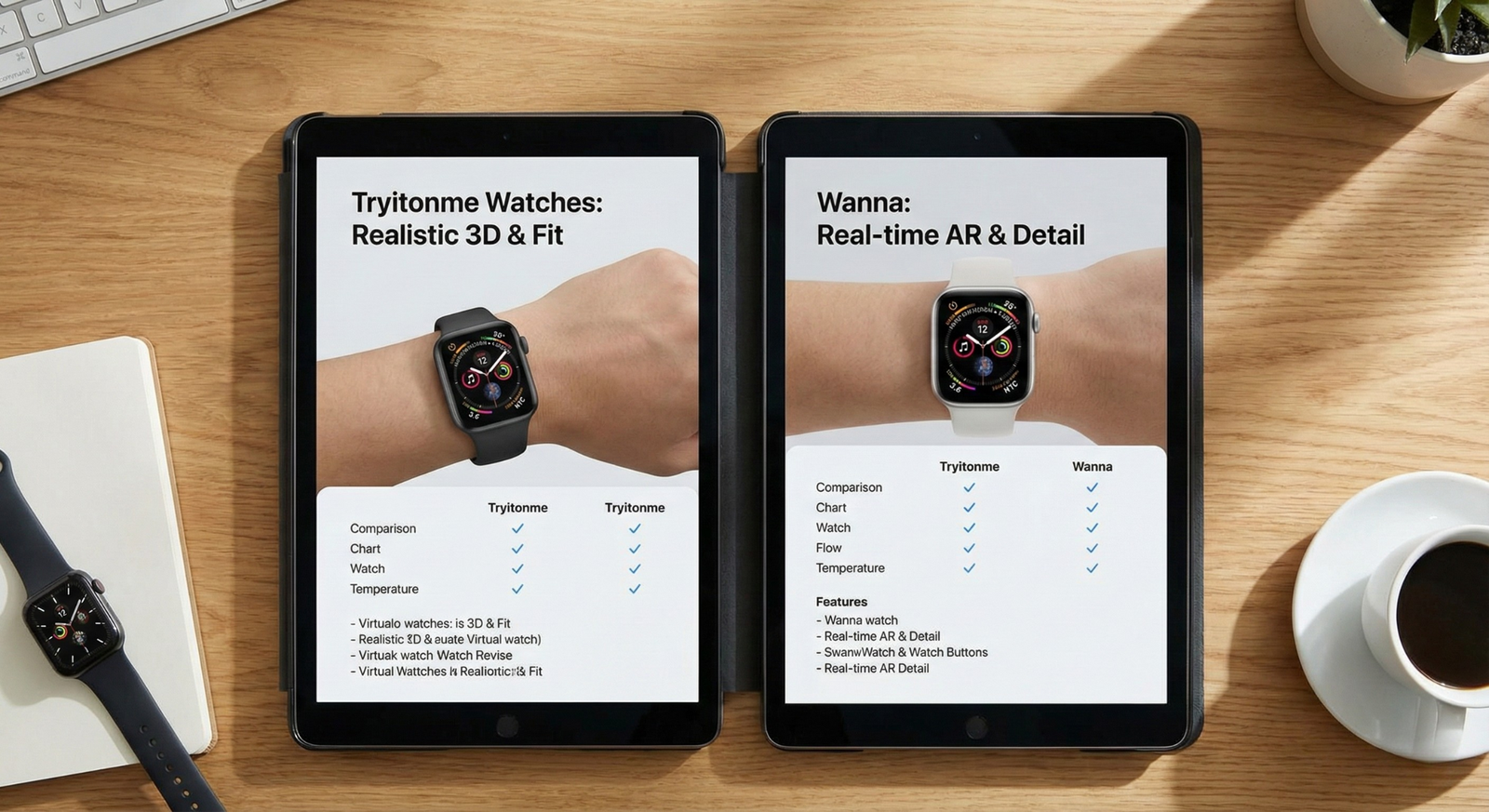
Request three wireframe thumbnails for handoff:
Desktop hero overlay — CTA on main image, modal try‑on, return to PDP.
Desktop price‑adjacent — CTA next to price and Add to Cart, new tab try‑on.
Mobile sticky — floating bottom button, modal try‑on flow.
Iconography: watch or eye + short label. Color contrast: aim for 4.5:1 contrast ratio (WCAG). Provide step flows: CTA → permission → calibration → try → add to cart.
Example microcopy bank (ready to paste)
Primary CTAs: “Try on your wrist”, “See how it fits”, “Try it — no download”.
Permission fallback: “Camera blocked — Upload a wrist photo”.
Loading: “Preparing your try‑on — one moment”.
Tips: “Hold wrist flat for best fit”.
Success: “Like it? Add to cart or share a photo.”
Errors: “Camera unavailable — try upload or view models.”
Privacy, legal & UX considerations
Privacy microcopy (user‑facing): “We use your camera only for the try‑on session; no images are stored without your permission.” For GDPR: show a consent checkbox before analytics/tracking, and provide a clear opt‑out for storing any try‑on photos. Consult legal counsel for jurisdiction‑specific text.
Case studies & expected outcomes (how to present results)
When you present outcomes, label numeric uplifts as hypothetical unless you have published data. For example: “Hypothetical conservative estimate: a 15–25% uplift in PDP conversion after adding link‑based VTO” — mark as hypothetical; see VTO examples and business benefits here: The1916 and Formex. Replace with your real metrics if you have them.
Final launch checklist (actionable)
Marketing: define microcopy, hero visuals, social creative — 2 days.
A link‑based VTO is a shareable URL that opens a try‑on experience (modal or new tab) without SDK installation. Use it for fast experiments, cross‑channel sharing, and low engineering overhead — see tryitonme.com.
2. How do I track try‑on events and conversions?
Append URL params and UTMs to the try‑on link (?sku=ABC123&utm_source=product&utm_medium=pdp) and fire events on click, session start, and try‑on completion. Capture try‑on → add‑to‑cart in your analytics for attribution.
3. What should I do if the user blocks the camera?
Surface immediate fallbacks: an upload photo flow, pre‑rendered model wrists by size, or GIF/video previews. Put these options next to the CTA and in the permission dialog to reduce dropoff.
4. Do I need developers to implement tryitonme links?
No — tryitonme is zero‑code link‑based for basic deployment (paste a shareable link into your PDP or gallery). For modal embeds or advanced tracking you may want a small theme/shortcode insertion.
5. What privacy/consent steps are recommended?
Explain camera use before permission; state that images are not stored without consent. For GDPR, add a consent checkbox if storing analytics or photos and provide an opt‑out for saved assets. Consult legal counsel for exact wording.
6. How do I test CTA placement effectively?
Run A/B tests comparing hero overlay vs price‑adjacent vs sticky mobile. Track Try‑on CTR, engagement time, and downstream add‑to‑cart for at least 3–4 weeks or until you reach statistically useful sample sizes.