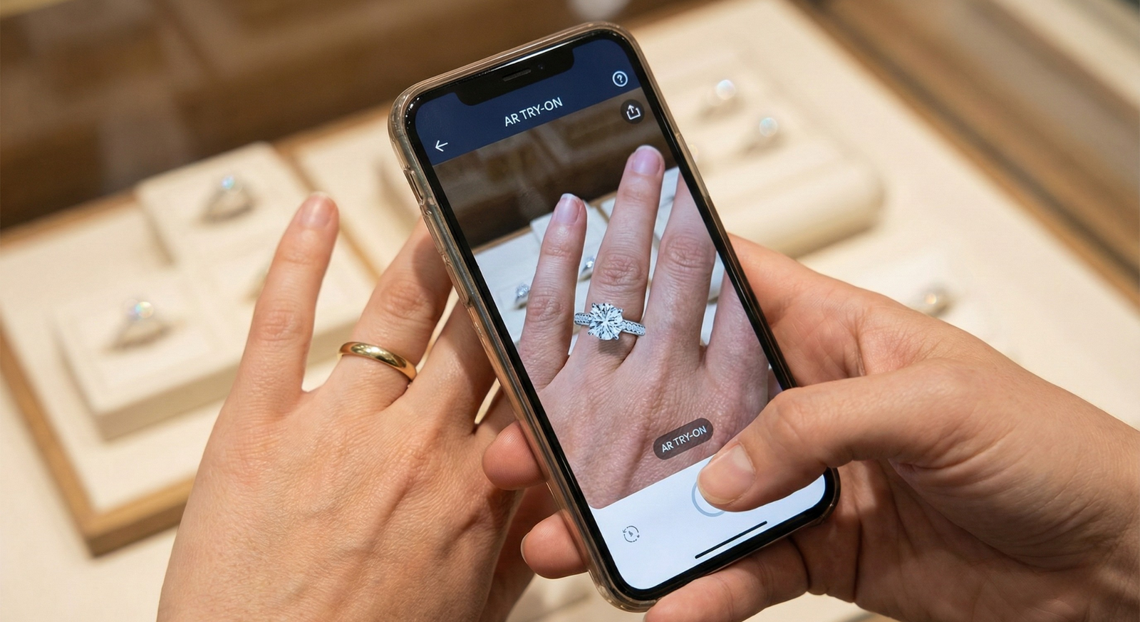
Jewelry Try On UX VTEX: Design Patterns, CTA Placement & PDP Conversion Best Practices
- Reduce visual uncertainty quickly so shoppers can move from product page to purchase.
- Use contextual VTO placements (gallery, modal, or dedicated page) based on product and traffic.
- Prioritize accessibility, fallback flows (upload/GIF), and variant persistence to protect conversion.
- Tryitonme.com offers zero-code, link-based VTO for fast VTEX experiments (ready in ~3 business days).
Introduction
jewelry try on ux vtex is about removing visual doubt at the moment shoppers decide. Product pages that fail to answer scale, fit, and context questions create hesitation — and research on product page guidelines shows that reducing visual uncertainty is a key driver of conversion and customer confidence (see Nielsen Norman Group product page guidance and Baymard research summaries).
Tryitonme.com offers a practical, no-code way to add virtual try-on for accessories (jewelry, eyewear, watches, hats) via a simple shareable link — no SDKs, no API work. Onboarding is fast and straightforward:
- Purchase a 6‑month package based on SKU count.
- Send standard product photos (front/side for eyewear; flat shots for jewelry).
- Tryitonme.com’s team and AI handle AR processing.
- Receive a unique, ready-to-use try-on link in under 3 business days (learn more: tryitonme.com). More details & pricing
Why read on: you’ll get design-first patterns for VTEX PDPs, exact CTA placement guidance, copy you can paste, and a zero-code VTEX setup so your merch and growth teams can run experiments quickly.
Why jewelry try-on matters for conversion
Shoppers buy jewelry emotionally and visually. They need to resolve scale, placement, and style in context — questions that static photos only partly answer. Augmented product visualization reduces that uncertainty by showing approximate fit and how an item looks on a person or in context. For a general overview of AR and product visualization benefits, see Shopify’s enterprise AR guide. For product-page behavior and how UX affects buying decisions, see Baymard.
Business pain and qualitative benefits
- Visual ambiguity → hesitation, lower add-to-cart intent, and potential returns.
- VTO reduces ambiguity and raises shopper confidence.
- VTO supports personalization (the item looks “made for me”).
- Better expectation-setting often reduces mismatch between expectation and real product.
What to do next
- Start by mapping your highest-consideration SKUs (rings, statement earrings, watches). Pricing & SKU guidance
- Prioritize those PDPs for a VTO experiment; measure add-to-cart and return-rate changes.
UX patterns for VTO on VTEX PDPs
Use the right pattern for your product, layout, and traffic mix. VTEX allows CMS blocks and template edits that make these options straightforward (see VTEX developer docs). Modal and gallery patterns should follow established image/gallery UX guidance (see NN/g on product image galleries: product image gallery guidance).
Inline image gallery integration
When to use
- Strong visual merchandising and clean galleries (rings, earrings, eyewear).
Pros
- Contextual discovery (appears with photos).
- Natural for visual shoppers.
Cons
- Can compete for attention with product images.
- Needs mobile layout adjustments.
Recommended next steps
- Add a “Try On” tile as the last frame in the gallery.
- On click, open the try-on in a modal or new tab (A/B test both).
Modal/overlay try-on
When to use
- You want shoppers to stay on PDP and return to the same state.
Pros
- Preserves PDP state and variant selection.
- Low friction for testing.
Cons
- Must be responsive and easy to close; follow modal best practices: NN/g modal guidance.
Recommended next steps
- Implement modal with clear close, escape behavior, and keyboard focus management (important for accessibility).
Dedicated try-on micro-page
When to use
- Complex variants or campaign landing pages where education matters.
Pros
- Full space for tooltips, guides, and product education (see Baymard on landing pages: Baymard).
Cons
- Extra navigation step; may increase drop-off.
Recommended next steps
- Use for social/influencer traffic or complex SKU families; track drop-off separately.
Sticky “Try On” button for mobile
When to use
- Mobile-first traffic and long PDPs.
Pros
- Persistent visibility, good thumb-zone reach.
Cons
- Must not obscure cart or selectors (follow mobile thumb-zone guidance: NN/g mobile thumb-zone).
Recommended defaults
- Height: 48–56px touch target.
- Keep 12–16px spacing above cart/sticky bars.
- High z-index but avoid blocking interactive elements.
Try on CTA placement
Your CTA needs clear hierarchy and accessibility. Use Baymard recommendations for CTAs and visual hierarchy: Baymard and check contrast/size guidance at WebAIM.
Above-the-fold near price/Add to Cart
Why it works
Decision moment proximity: shopper is ready to compare/confirm.
Pros
- High visibility, easy to A/B test.
Cons
- Limited space; must balance with Buy CTA.
Recommended default (desktop)
- Place a secondary but prominent “Try On” button beside Add to Cart. Use an outlined or accent color and a jewel/face icon. Make it keyboard-focusable and include an aria-label.
Within the image carousel
Why it works
Contextual and discoverable for image swipers.
Tradeoffs
- Can be missed if users don’t interact with the carousel.
Sticky floating button bottom-right (mobile)
Why it works
Persistent and easy for thumbs.
Implementation notes
- Size 48–56px, min touch area 44x44px.
- z-index higher than page content but below browser UI; leave 12–16px margin from bottom sticky cart.
- Ensure keyboard focus and visible outline for accessibility.
Secondary placements (description / below-the-fold)
Why it works
Educational reinforcement for hesitant shoppers.
Use cases
- Place copy that explains benefits and a secondary CTA for those who read specs.
Visual mockup guidance
Include two mockups (desktop near ATC and mobile sticky). Caption templates and accessibility callouts below. Mockup guidance
Mockup 1 — Desktop PDP (caption)
Placement: Try On button beside Add to Cart; keyboard focus order: Try On → Add to Cart → Buy Now. Alt text: “Desktop product page showing Try On button next to Add to Cart.” Accessibility callout: ensure aria-label=”Try on virtually” and focus trap handled in modal.
Mockup 2 — Mobile PDP (caption)
Placement: Sticky round button lower-right labeled “Try On” with jewel icon; image carousel also includes Try On tile. Alt text: “Mobile product page with sticky Try On CTA.” Accessibility callout: ensure touch target 48px, appropriate contrast, and does not hide essential controls.
Microcopy: CTAs, tooltips, success & error messages
Use short, clear microcopy. Refer to NN/g microcopy guidance: NN/g microcopy and Baymard privacy UX notes: Baymard.
CTA wording options
Ready-to-use labels for testing:
- Try on
- See it on you
- Try it virtually
- Try on in 10s
Supporting microcopy
- No camera? Upload a photo.
- Try at home — no app required.
- Camera feed is local; no photos stored. (Verify privacy wording with tryitonme.com legal/privacy pages before publishing.)
- Works on desktop and mobile.
Example flows & snippets
Pre-click (tooltip)
- “Try this ring on with your camera — takes 10 seconds.”
Success
- “Looks great — add to cart.”
Permission denied
- “Camera unavailable? Upload a photo instead.”
Error
- “We couldn’t load try-on right now. Try again or view on a model.”
Fallbacks & edge cases
Follow WCAG and camera-permission guidance: WCAG and camera/streaming guidance.
Device & permission fallbacks
- Camera denied: show photo upload flow.
- Desktop without camera: allow upload or model preview.
- Provide GIF/video or model overlay when interactivity is impossible.
Bandwidth & performance fallbacks
- Low-res-first previews, lazy-load heavy assets.
- Don’t block PDP render; follow web performance guidance: web.dev/fast.
Variant & sizing fallbacks
- Map try-on to nearest SKU where exact asset is missing.
- Show clear messaging when the exact variant isn’t available.
Accessibility & privacy
- Keyboard-accessible controls and screen-reader labels.
- Provide explicit privacy reassurance and link to vendor privacy docs (confirm with tryitonme.com).
PDP conversion best practices
Keep try-on tightly coupled to the conversion funnel. NN/g and Baymard provide product-page principles you should follow: NN/g product page guidance and Baymard.
Align try-on with conversion funnel
- Ensure try-on leads to an Add to Cart flow with the selected variant persisted.
- Don’t force shoppers to re-select size/color after try-on.
Visual confirmation & variant persistence
- Display selected SKU/variant after try-on.
- Provide a one-click Add to Cart that maps to the stored selection.
Combining VTO with social proof & guarantees
- Place customer photos/reviews near the Try On CTA.
- Use warranty/return info but avoid overly aggressive urgency language.
Performance & page weight
- Lazy-load try-on assets and scripts.
- Keep main PDP interactive while additional VTO assets load (web.dev/fast).
Implementation on VTEX with tryitonme.com
VTEX merchants can deploy tryitonme.com quickly without engineering work. VTEX CMS blocks or product templates support simple anchor linking (VTEX dev docs: developers.vtex.com). tryitonme.com product and onboarding info: tryitonme.com. Implementation notes
Why tryitonme.com is the Right Fit for Your Business
- Zero-code, link-based deployment — no SDK or API required.
- Fast time-to-market: receive a ready-to-use try-on link in under 3 business days.
- Accurate accessory VTO tuned for jewelry, eyewear, watches, and hats.
- Simple onboarding: purchase a 6‑month package, send standard product photos, tryitonme.com team/AI handles AR processing, receive shareable links.
- Works across web, mobile, and social for rapid merchandising tests. comparison notes
Call to action
High-level VTEX setup steps
Zero-code integration in 4–6 steps:
- Generate the tryitonme.com link for a SKU.
- Add a Try On button in the VTEX CMS block or product template.
- Paste the link into the button href.
- Configure variant mapping in your merchandising dashboard (match SKU → tryitonme link).
- Test on desktop/mobile and confirm analytics events.
- Launch and A/B test.
Copy-paste anchor snippet
<a href="https://tryitonme.com/TRYITONME_LINK" target="_blank" rel="noopener" aria-label="Try on this product">
  Try On
</a>
Practical use-cases & placements
- Desktop: Try On next to Add to Cart.
- Mobile: Sticky Try On CTA + carousel tile.
- Social: use the shareable link in Instagram/Facebook posts or influencer bios.
Measurement & A/B testing plan
Track engagement and commerce outcomes. Use GTM patterns: GTM docs and A/B testing best practices: Optimizely A/B testing guide.
Metrics to track
- Try-on clicks / impressions
- Try-on → Add-to-cart rate
- PDP conversion rate (try-on vs non-try-on)
- Camera vs upload usage
- Completion rate
- Return rate by cohort
Suggested A/B tests
- CTA copy: “Try on” vs “See it on you”
- Placement: near ATC vs inline gallery
- Experience type: modal vs dedicated page
- Microcopy: privacy snippet vs none
- Asset order: camera-first vs upload-first
- Post-try-on CTA: Add to Cart vs Save Look
Tracking implementation notes
Example dataLayer event:
dataLayer.push({
  event: "tryon_click",
  product_id: "SKU123",
  product_type: "ring",
  tryon_method: "camera",
  placement: "pdp_near_atc"
});
Map this event to conversions and funnels in GTM/GA.
Visuals, examples & microcopy library
Required mockups and microcopy snippets for testing. See earlier mockup captions and accessibility callouts. Guidance: visual mockup guidance.
Required mockups (H3)
Mockup 1 — Desktop PDP (ALT text)
Alt text: “Desktop PDP with Try On button beside Add to Cart.” Caption: Place Try On to the right of price/Add to Cart; ensure keyboard order and aria-label.
Mockup 2 — Mobile sticky CTA (ALT text)
Alt text: “Mobile PDP with sticky Try On button bottom-right.” Caption: Sticky CTA should be 48–56px with 12–16px safe margin from bottom.
Microcopy snippets table
(Select snippets to A/B test)
- CTAs: Try on; See it on you; Try it virtually; Try on in 10s; Preview on me; View in try-on
- Tooltips / support: No camera? Upload a photo.; Try at home — no app required.; Camera feed stays local. (Verify with tryitonme.com privacy docs.)
- Success / error: Looks great — add to cart.; Perfect fit? Continue shopping.; Camera unavailable — upload a photo instead.; We couldn’t load try-on. Try again or view on model.
Analytics snippet & VTEX CMS copy
Anchor snippet (repeat):
<a href="https://tryitonme.com/TRYITONME_LINK" target="_blank" rel="noopener" aria-label="Try on this product">
  Try On
</a>
dataLayer snippet (repeat):
dataLayer.push({
  event: "tryon_click",
  product_id: "{{product.sku}}",
  product_name: "{{product.name}}",
  placement: "pdp_near_atc",
  tryon_method: "camera"
});
Launch checklist & QA
Pre-launch
- [ ] Generate tryitonme.com link per SKU.
- [ ] Add Try On CTA to PDP (desktop & mobile).
- [ ] Confirm variant mapping and SKU alignment.
- [ ] Verify camera and upload fallbacks.
- [ ] Set up analytics events (click, start, complete).
- [ ] Accessibility checks: aria-labels, keyboard focus, screen-reader text.
- [ ] Performance checks: lazy-load, non-blocking scripts.
Post-launch
- [ ] Smoke test across devices and browsers.
- [ ] Monitor try-on CTR and completion rate.
- [ ] Start A/B tests (copy/placement).
- [ ] Review returns and variant-level engagement after 30–90 days.
Conclusion + next steps
A well-designed VTO for jewelry reduces uncertainty, supports PDP decisions, and can increase add-to-cart and conversion when implemented without friction. With tryitonme.com’s zero-code link approach you can run experiments fast and iterate quickly on VTEX.
Next steps
- Pick 5–10 SKUs to start.
- Generate tryitonme.com links and add the Try On CTA to your PDPs.
- Run an A/B test on CTA placement and copy.
Ready to try it? Book a demo: tryitonme.com
Appendix: resources & templates
- VTEX developer docs
- tryitonme.com product & onboarding
- WCAG accessibility
- Web performance guidance
- NN/g UX and microcopy
- Baymard product-page research
Copy-paste assets
Anchor HTML (paste into VTEX CMS button link)
<a href="https://tryitonme.com/TRYITONME_LINK" target="_blank" rel="noopener" aria-label="Try on this product">
  Try On
</a>
dataLayer example (paste into click handler)
dataLayer.push({
  event: "tryon_click",
  product_id: "{{product.sku}}",
  product_name: "{{product.name}}",
  placement: "pdp_near_atc",
  tryon_method: "camera"
});
Microcopy library (See Microcopy snippets table above — pick and A/B test 2–3 variants.)
Illustrative ROI example (HYPOTHETICAL)
- Assume a PDP with 10,000 monthly visits.
- If 3% try the feature → 300 try-on sessions (illustrative only).
- If try-on users add-to-cart at a higher rate, incremental revenue follows.
(These numbers are hypothetical and for planning; validate with your analytics.)
Final note on privacy claims: If you plan to state specifics about local camera processing or storage, verify the exact wording against tryitonme.com’s privacy/legal documentation before publishing.
Call to action (final): Ready to run a zero-code jewelry VTO test on VTEX? Book a demo and get a trial link: tryitonme.com
FAQ
1. What if the shopper denies camera permission?
Provide an immediate upload flow (photo upload) and a model/GIF preview as fallback. Clearly surface the upload CTA and a short explanation: “Camera unavailable? Upload a photo instead.”
2. Will try-on slow down my PDP?
Not if you lazy-load VTO assets and scripts, and avoid blocking the main PDP render. Load a low-res preview first and fetch heavier assets after initial interactivity (see web.dev/fast).
3. How do I keep selected variants after try-on?
Persist variant selection in the try-on link parameters or map the SKU on return so the Add to Cart action uses the stored selection. Confirm the returned variant is applied before adding to cart.
4. What privacy messaging should I show?
Explain that the camera feed is local and provide a link to the vendor privacy/legal page. Verify specific claims with tryitonme.com legal before publishing.
5. Which CTA copy should we test first?
Start with “Try on” vs “See it on you.” These are short, clear, and capture intent; measure click-through and post-try-on add-to-cart rates.
6. How should we measure impact?
Track try-on clicks, completion rate, try-on → add-to-cart conversion, and returns by cohort. Use dataLayer events and map them into GTM/GA for funnel analysis.