Eyewear Try On UX Webflow — No-code patterns to boost PDP conversions
Quick Summary
- Add virtual try-on (VTO) via link-based tools to reduce fit uncertainty and increase PDP conversions.
- No-code approach in Webflow: store TryOnLink in your CMS, bind a CTA, and choose open-in-new-tab or modal based on device.
- Prioritize UX: frictionless initiation, transparent permissions, fallbacks (upload/model), and mobile-first performance.
- Measure key events (tryon_link_click, tryon_session_start, selected_variant_added_to_cart) and run A/B tests on CTA placement.
Introduction — what you’ll learn (eyewear try on ux)
You’ll get a practical playbook for adding virtual try-on to eyewear product pages, focused on UX, CTAs, fallbacks, and a Webflow no-code pattern you can ship fast. See the Webflow guide on link-based VTO for step-by-step setup: link-based VTO guide. This guide shows how link-based VTO (like tryitonme.com’s shareable product links) plugs into your PDP without SDKs or heavy dev work — and how to design the experience so shoppers actually use it.
Why VTO matters for eyewear PDP conversion (pdp conversion best practices)
Fit uncertainty is a top reason shoppers hesitate on eyewear PDPs; virtual try-on directly reduces that friction by showing frames on the shopper’s face. For practical guidance on frame fit, see the frame fit guide. Over 72% of online eyewear buyers expect virtual try-on capabilities, making it a feature many customers now see as table stakes (see FittingBox).
AR try-on also raises engagement and fit confidence by simulating real-world fit with facial tracking — brands adopting this tech report stronger interaction metrics and more confident buying decisions; see this industry overview at KiksarVR.
Core UX principles for eyewear virtual try-on (eyewear try on ux)
Follow these practical, product-first rules when you place a try-on feature on PDPs:
- Frictionless initiation: One clear entry point (single click/tap) to start a try-on session; provide a short on-screen guide (e.g., oval/face markers) to help users position themselves. See UX patterns for virtual try-on at Toptal.
- Transparent permissions: Before the browser camera prompt, show a short line saying what you need and why (video stays local, no upload unless they opt in). Reference: Auglio blueprint.
- Progressive disclosure: Make try-on an enhancement, not a blocker — keep Add to Cart visible so conversion pathways never disappear. Research on progressive disclosure and accessibility: PubMed Central.
- Accessibility: Add ARIA labels for controls, keyboard focus states for launch buttons, alt text for fallback images, and readable contrast on overlays. See accessibility guidance: Accessibility paper on AR & UX.
- Performance first: Lazy-load the try-on assets and prioritize mobile performance; a fast PDP increases the likelihood users will try and then buy. See mobile performance guidance: Mobile performance guide.
Why tryitonme.com is the Right Fit for Your Business (webflow try on ux)
- ZERO-CODE, LINK-BASED: Deploy try-on via a unique shareable product link — no SDK or API required (paste a link into Webflow CMS). See tryitonme.com.
- FAST DELIVERY: Submit standard product photos; receive a ready-to-use try-on link in under 3 business days. Example service: service turnaround.
- SIMPLE ONBOARDING: One package purchase, provide photos, AR processing delivered as links — minimal effort on your side.
- DISTRIBUTABLE: Links work across web, mobile, and social channels without custom integration.
Webflow-specific implementation patterns (no-code) (webflow try on ux)
CMS pattern: storing a try-on link per product (webflow try on ux)
Steps:
- In Webflow CMS Collection (Products), add a Plain Text field named
TryOnLink. - Populate
TryOnLinkwith the tryitonme.com product URL (e.g.,https://tryitonme.com/product/your-sku). - On the Product Template, add a button and bind its Link to the CMS field
TryOnLink. - Choose whether the link opens in a new tab or triggers a modal (see next section).
(Placeholder: include screenshots of CMS field, PDP binding, and a reusable symbol.)
Launch options: new tab vs modal vs full-screen (webflow try on ux)
- New tab (recommended default): Fastest to implement and avoids modal stacking or interaction conflicts; retains PDP context. Read more: KiksarVR.
- Modal / lightbox: More immersive on desktop; keeps the user on the same page but can be tricky on some mobile browsers. Reference: Auglio.
- Full-screen handoff: Use for a native-like mobile experience (open link in same tab/fullscreen).
When custom code is unnecessary (webflow try on ux)
Because tryitonme.com is link-based, you avoid dev debt from SDKs/APIs — there’s no custom integration, easier QA, and faster rollout. This reduces engineering cycles and simplifies A/B testing. See industry notes: KiksarVR overview.
Try-on CTA placement: patterns & recommendations (try on cta placement)
Desktop patterns (try on cta placement)
- Hero overlay: Visible over the main product image — high visibility for discovery. Reference: Auglio.
- Next to price/Add to Cart: Dual-CTA layout (Try On + Add to Cart) keeps buying options clear.
Rules: Keep both CTAs above the fold; ensure the try-on button uses a distinct visual weight so it’s perceived as an optional tool, not a requirement.
Mobile patterns (try on cta placement)
- Sticky bottom bar: A persistent bar with Try On (primary) and Add to Cart (secondary). This avoids forcing users to scroll. Guidance: FittingBox.
- Floating Action Button (FAB): Single high-contrast button floating above content for quick access.
Design notes: Use at least 44–48px hit targets for touch, and ensure the sticky CTA doesn’t obscure product details or the ATC.
Suggested A/B tests for placement (try on cta placement, pdp conversion best practices)
Prioritized experiments:
- Hero overlay vs inline CTA (Hypothesis: overlay increases try-on CTR). Run 2–4 weeks; aim for 95% confidence. See testing ideas: Auglio.
- Modal vs new tab (Hypothesis: modal raises session depth; new tab yields faster recovery of PDP).
- Sticky bottom bar vs inline CTA on mobile (Hypothesis: sticky increases try-on launches and try-to-buy rate).
Microcopy that converts — CTAs, permission prompts, trust copy (eyewear try on ux)
High-converting CTA copy bank (try on cta placement)
Test these six options (start with #1 and #4):
- “Try On”
- “Try On — See how it fits”
- “Try on these glasses”
- “Try On — Free & Private”
- “Try On in 10s”
- “Try On Virtually”
Camera permission & privacy microcopy (eyewear try on ux)
- Before camera prompt: “We need camera access to show these on your face — video stays on your device.”
- If blocked: “Camera blocked? Upload a photo or view frames on a model profile.”
- Trust booster near CTA: “No obligation — private preview, no account needed.” See blueprint: Auglio.
Fallbacks & progressive enhancement (eyewear try on ux)
Design a hierarchy of fallbacks so no customer is blocked.
Upload-photo & model face alternatives (pdp conversion best practices)
Priority fallbacks:
- Upload a selfie (user-provided photo).
- Model-face images with size overlays (mm measurements).
- 360° product spins and multiple model shots.
- Virtual appointment / book-a-demo.
Show microcopy examples:
- Upload CTA: “Upload a photo — see these on you”
- Model view CTA: “See on model — choose size”
Webflow conditional UI patterns for fallbacks (webflow try on ux)
Use CMS flags or item fields like HasTryOn (true/false) and Webflow interactions to show/hide fallback CTAs. Example: if TryOnLink is empty, show “See on model” and “Upload photo” instead.
PDP conversion best practices when adding virtual try-on (pdp conversion best practices)
- Visual hierarchy: Hero image + Try On CTA + price + Add to Cart (above the fold). Reference: Auglio.
- Post-try-on action: Offer “Add selected to cart” so the chosen frame/size is preselected after the session. See frame-fit guide: Frame fit practical guide.
- Social proof: Add photo reviews near the try-on CTA to reinforce trust.
- Performance: Mobile-first optimization and lazy-loading assets to keep load times low. See: FittingBox.
Measurement & A/B test ideas (pdp conversion best practices)
Key metrics & recommended events:
tryon_link_click(when user clicks the link/button)tryon_session_start(session handshake with tryitonme.com)tryon_session_complete(completed preview)selected_variant_added_to_cart(post-try-on add-to-cart)
Tag tryitonme.com link clicks with UTM parameters to track source campaigns and use Webflow analytics or your analytics tool to tie try-on behavior to conversions. See analytics plan: Try-on analytics plan.
Sample A/B test plan template (pdp conversion best practices)
- Hypothesis: “Switching Try On to a hero overlay will increase try-on CTR and try-to-purchase rate.”
- Variants: inline button vs hero overlay
- Duration: 2–4 weeks (or until min sample per variant reached)
- Success threshold: 95% confidence
- Metrics: tryon_link_click, try-to-purchase rate, PDP conversion lift
Quick Webflow + tryitonme.com implementation checklist (webflow try on ux)
- Generate tryitonme.com product link (include SKU).
- Add TryOnLink field to Webflow CMS per product.
- Bind PDP Try On button to the TryOnLink field (set target: new tab or modal).
- Add mobile sticky CTA symbol bound to the same field.
- Add analytics UTMs to the link and instrument
tryon_link_clickevent. - Test on desktop and mobile; validate fallbacks (upload/model).
- Publish — no SDK/API required.
Accessibility & privacy checklist (eyewear try on ux)
- Use ARIA labels on the Try On button and controls.
- Ensure keyboard navigation and focus states for modal launch.
- Provide alt text and model-image descriptions for fallbacks.
- Display clear privacy copy: local processing, optional uploads, retention policy.
- If you store images, include GDPR/consent language (consult legal).
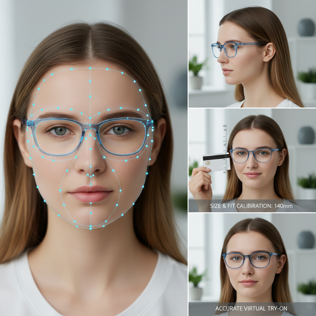
Visual assets and examples to include in the post (eyewear try on ux)
Required visuals to produce:
- Desktop hero overlay wireframe (callout: Try On + Add to Cart).
- Mobile sticky CTA wireframe (bottom bar + FAB).
- Modal vs new-tab flow GIF demonstrating opening a tryitonme.com link.
- Webflow CMS screenshots: TryOnLink field, PDP binding, reusable symbol.
(Use production screenshots and GIFs; placeholders shown in draft posts should be replaced before publish.)
Mini success story / example outcome (pdp conversion best practices)
Hypothetical example (labeled): A brand implemented link-based try-on on Webflow and prioritized a mobile sticky CTA. Based on industry benchmarks for engagement and fit confidence, the brand could expect measurable lifts in time-on-page and quicker purchase decisions (industry overviews: FittingBox and KiksarVR). (Note: illustrative scenario, not a claim of specific client results.)
One-page printable cheatsheet (pdp conversion best practices)
- CTA: Above fold — “Try On — Free & Private”.
- Mobile: Sticky bottom bar with 48px tap target.
- Fallbacks: Upload photo → Model images → 360° product.
- CMS: Add TryOnLink field per product.
- Open try-on links in new tab by default for simplest UX.
- Track events: tryon_link_click, tryon_session_start, selected_variant_added_to_cart.
- A/B test: Hero overlay vs inline CTA; modal vs new tab.
- Accessibility: ARIA labels + alt text.
Conclusion + Call to action (eyewear try on ux webflow)
Adding virtual try-on to your Webflow PDPs doesn’t need heavy engineering: with link-based VTO you can add a Try On button, run experiments, and measure impact quickly. If you want a fast, zero-code rollout and a ready-to-use product link in days, Book a Demo with tryitonme.com to generate a try-on link and get started.
Appendix & resources (webflow try on ux)
- Virtual clothing try-on UX patterns — Toptal
- Accessibility paper on AR & UX — PubMed Central
- Eyewear VTO industry overview — Auglio
- Virtual glasses try-on primer — KiksarVR
- Why VTO matters (FittingBox)
- tryitonme.com — demo & get started
- Webflow no-code VTO guide
- Frame fit practical guide
- Pupillary distance guide
- Mobile performance guide for VTO
- Try-on analytics plan
- Product photo requirements for VTO
Downloadable assets included with this post
- CTA copy bank (6 variations)
- Printable one-page cheatsheet
- A/B test template
- Webflow screenshots and modal/new-tab GIFs (placeholders to replace with production images)
If you want, I can convert the cheatsheet into a printable PDF and prepare the Webflow screenshot pack (CMS field, PDP binding, CTA symbol) for your design and engineering teams.
FAQ
1. Do I need an SDK to add try-on in Webflow?
No — with a link-based solution like tryitonme.com, you can embed one link per product in the Webflow CMS without any SDK or API integration.
2. Which launch method is the fastest to test?
Open the try-on link in a new tab as the default: it’s the fastest to implement and most stable across browsers. Use the modal when you need a more immersive experience and are ready to address some mobile edge cases.
3. How do you handle users who refuse camera access?
Provide fallback options: upload selfies, model-face views, and 360° spins. Ensure the microcopy explains that video is processed locally where relevant (see privacy blueprint).
4. What events should I instrument?
At a minimum: tryon_link_click, tryon_session_start, tryon_session_complete, and selected_variant_added_to_cart. Tag links with UTMs for campaign analytics (see the try-on analytics plan).
5. Are there any specific accessibility recommendations for the try-on?
Yes—ARIA labels on controls, keyboard focus for modal launches, alt text for fallback images, and clear permission text. See accessibility research: PubMed Central.