Eyewear Try On UX Magento: PDP Conversion Best Practices for Try‑On CTAs
- Start with link-based VTO for quick testing without the engineering overhead.
- Place CTAs in multiple locations (near the Add-to-Cart, image overlays, sticky mobiles) and A/B test them.
- Provide fallbacks (photo uploads, model images) and ensure event tracking for analytics.
Introduction — Goal and audience
You’re reading this because you want to improve eyewear try on UX on your Magento product pages to lift engagement and conversions without a heavy engineering lift. This post gives clear, testable PDP patterns, copy, and implementation options you can use right away.
tryitonme.com is a no‑code, link‑based Virtual Try‑On (VTO) platform for accessories (eyewear, jewelry, watches, hats). Onboarding is simple: you purchase a 6‑month package by SKU quantity, send standard product photos (front/side for eyewear), the tryitonme.com team/AI handles AR processing, and you receive ready‑to‑use try‑on links in under 3 business days. See an onboarding summary for Magento implementations here.
The guidance below is written for Magento e‑commerce managers, UX designers, and product owners who need practical UX patterns and a fast path to deploy VTO on PDPs.
Why virtual try‑on matters for eyewear
Good VTO reduces shopper uncertainty and makes fit and style decisions easier on product pages. That can increase engagement with SKUs and support purchase intent when implemented well. For context on retailer ROI and use cases for blue‑light and prescription eyewear, see this overview on try‑on benefits here. Industry vendors and platforms have published work describing how augmented reality and virtual try‑on create interactive shopping experiences — for a high‑level overview from a major AR commerce vendor, see Snap’s guidance on augmented reality for shopping. For usability and checkout friction insights, Baymard Institute is a useful resource: Baymard.
- Reduces uncertainty about fit and appearance
- Empowers shoppers to compare frames and styles quickly
- Improves product engagement on PDPs (time on page, interactions)
- Creates additional moments to prompt Add‑to‑Cart or Save actions
Magento context — platform constraints & opportunities
Magento (Adobe Commerce) PDPs generally include a product gallery, price/Add‑to‑Cart block, variant selectors, and optional CMS or static blocks. You’ll commonly see themes and PWAs that separate gallery and action areas into predictable zones. Adobe’s developer guidance is useful when planning performance and PWA considerations: Adobe Commerce developer docs.
Opportunities
- Flexible CMS blocks and Page Builder let you add CTAs or small embed links without deep theme changes.
- PWAs and modern themes support sticky bars and dynamic overlays if you use client‑side rendering.
Constraints
- Theme templates and app shells can limit where you can place interactive elements without a frontend change.
- Performance budgets (especially on mobile) mean any VTO entry point should be lightweight and progressively loaded.
Eyewear try‑on UX — Magento‑specific considerations
Design decisions differ by device and theme. Consider these Magento‑specific tradeoffs.
Desktop vs mobile
- Desktop: Room for inline CTAs near price/Add‑to‑Cart and image overlay buttons. Overlays work well when unobtrusive and clearly labelled.
- Mobile: Prioritize a persistent, small entry — a sticky bottom bar or a compact inline button. Mobile bandwidth and camera permission UX are key.
Gallery vs modal tradeoffs
Link‑based VTO opens a new tab or lightweight modal that isolates camera access and avoids bundling heavy SDKs into your PDP. This reduces the risk of breaking theme JS and keeps page load fast. In‑page modals can feel more immediate but may require extra engineering and careful accessibility work.
Performance concerns
Avoid large SDKs or heavy scripts during initial page load. Progressive loading or link‑based try‑on (which launches the try‑on in a separate context) minimizes client‑side impact and is faster to deploy across channels (web, mobile, social). See a mobile performance discussion here.
Recommendation: Unless you need a deeply integrated AR SDK, start with a link‑based VTO to get testable results quickly while preserving site performance. tryitonme.com provides link‑based URLs you can drop into Magento without SDKs.
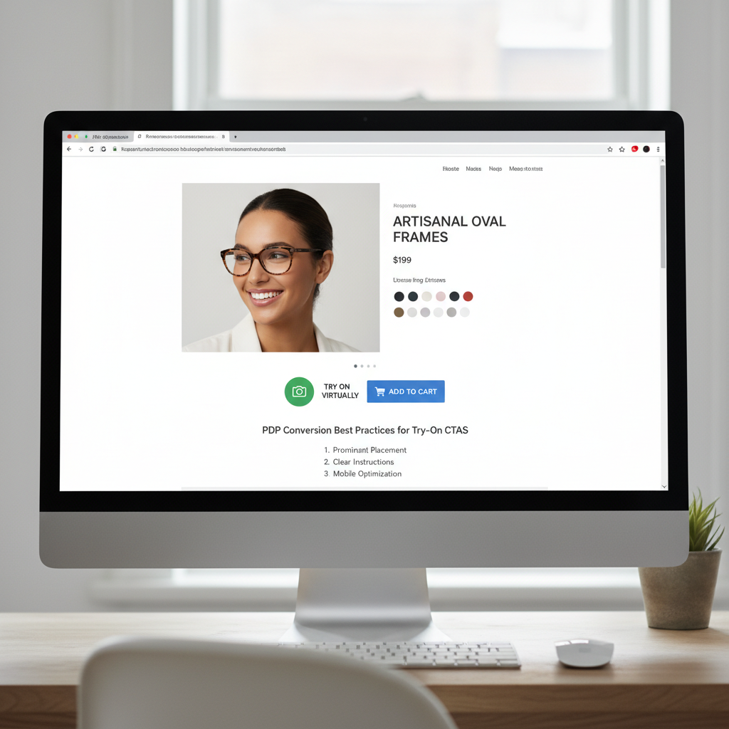
Try‑on CTA placement patterns to test
Below are practical placements to experiment with. Use analytics to A/B test combinations.
Inline near price/Add‑to‑Cart (desktop)
- Description: Place a secondary button next to or below the Add‑to‑Cart button.
- Pros: High‑visibility, near purchase actions.
- Cons: Can compete visually with Add‑to‑Cart if not styled as secondary.
Overlay CTA on main product image
- Description: Small circular or pill button on top of the hero image or corner badge.
- Pros: Contextual — user sees “this frame on you” where they expect visuals.
- Cons: Avoid obscuring product details; watch accessibility click targets.
Mobile sticky bottom bar
- Description: Slim persistent bar with try‑on CTA and a small icon.
- Pros: Always accessible on mobile; reduces discoverability problems during scroll.
- Cons: Must not crowd essential cart CTA; keep it small and dismissible.
Secondary CTA in thumbnails/product lists
- Description: Small “Try” link on product cards or thumbnails in category/list views.
- Pros: Promotes discovery early in the funnel; lowers friction to try multiple styles quickly.
- Cons: Lower intent context than PDP; keep it lightweight.
Default testing stack: CTA next to Add‑to‑Cart + image overlay + mobile sticky bar. Run A/B tests to refine priorities per device and SKU groups.
Microcopy that converts (CTA text + helper lines)
Strong, concise microcopy reduces friction. Test these variants in your experiments.
Primary CTA options
- Try On Now
- See It On You
- Virtual Try‑On
Benefit‑led lines
- Try Before You Buy
- See how these frames fit your face
Effort/time cues
- Try in 3s
- No app — try instantly
Helper microcopy
- Uses your camera — no account needed
- Photo upload available — no camera required
Camera fallback copy
- No camera? Upload a selfie
- Prefer not to use camera? See model shots
A/B test suggestion: test a short action verb (“Try On Now”) vs. a benefit + time cue (“Try in 3s — No app”).
Fallbacks & progressive enhancement
Don’t lose users who decline camera access or use low‑capability devices. Provide options.
Photo upload flow
Offer a simple file uploader for selfies. Minimal UX: choose file → automatic face detection prompt → preview → Add to Cart from preview. See an implementation example here. Keep file size and dimension guidance clear to avoid failed uploads.
Pre‑rendered model images / 3‑angle views
Provide front/side/three‑quarter model shots with the same frames as a fallback to satisfy users who don’t use camera features.
Sizing/fit overlays and measurement guidance
Include a gentle sizing guide: frame width, temple length, lens width. Provide measurement overlays and explain fit in plain language (e.g., “Fits small / true to size / wide face friendly”). See a frame fit guide here.
Accessibility & privacy (must‑have UX elements)
Follow WCAG and privacy best practices when launching camera capabilities.
Accessibility checklist
- Keyboard focusable try‑on CTA and dismissible modals
- ARIA labels for try‑on buttons (e.g.,
aria-label="Try on these frames") - Clear screen‑reader announcements when the try‑on modal opens
- Sufficient contrast for CTAs and helper text
Privacy & permissions
Explain purpose of camera use in plain language before requesting permission (see WCAG guidance at W3C WCAG). Provide an alternate flow (photo upload or model images) if camera is denied. For GDPR and privacy basics, see gdpr.eu.
PDP conversion best practices (design + funnel integration)
Actionable checklist:
- Place the try‑on CTA to support — not replace — the Add‑to‑Cart flow.
- Keep VTO entry lightweight and progressively loaded (don’t load camera scripts on initial page load).
- Ensure SKU/variant sync between PDP and try‑on link (pass variant ID/sku as URL params).
- After try‑on, show clear CTAs: Add to cart, Save look, Share.
- Capture analytics events for try‑on open, try‑on complete, and add‑to‑cart from try‑on for measurement.
Measurement & A/B testing plan
KPIs to track:
- Try‑on CTR (how many users click the try‑on CTA)
- Try‑on → Add‑to‑Cart rate
- PDP conversion rate (session base)
- Return rate (longer term)
- Time‑to‑purchase for try‑on users vs. non‑try‑on users
Test matrix:
- CTA placement: inline vs overlay vs sticky
- CTA copy: action vs benefit vs time cues
- Fallback prominence: uploader vs model images
- Device segmentation: desktop vs mobile
Magento tips: push try‑on open and try‑on complete events to the dataLayer and capture via Google Tag Manager (GTM docs). Use GA4 event naming and user property flags to segment try‑on users (see GA4 docs: GA4 events). For an analytics example and blue‑light try‑on metrics, see this resource.
Why tryitonme.com is the Right Fit for Your Business
- ZERO‑CODE, LINK‑BASED deployment — drop a URL into your PDP without SDKs or deep engineering.
- Ready‑to‑use try‑on links returned quickly after onboarding (buy package → send photos → AR processing → receive links).
- Works across web, mobile, and social channels — same link can be used in emails, product pages, and posts.
- Lightweight approach minimizes site performance impact and speeds time‑to‑test. Book a demo at tryitonme.com.
Implementation options — quick integration patterns for Magento
Three lightweight patterns:
- Insert Try‑On link next to Add‑to‑Cart (CMS block/button)
Add a secondary button in the product template or via a CMS static block positioned near price. Configure the button href to your try‑on URL and pass SKU/variant parameters.
- Image overlay linking to try‑on URL (anchor on gallery image)
Add a small overlay element on the hero image that links to the try‑on URL. For PWAs, ensure the overlay is inserted in the client render layer to avoid theme conflicts.
- Mobile sticky bar linking to try‑on URL
Use your theme’s sticky footer component or a small custom block that appears on product pages. Keep it dismissible and small.
Developer notes: ensure variant params (sku or product id) are appended to the try‑on URL so the VTO shows the correct frame. Progressive load camera scripts only after user click. Add dataLayer pushes for try‑on open/completion for analytics.
Example microcopy & CTA matrix (quick reference)
- Inline (desktop) → Try On Now → “See how this fits you” → Conversion focus: purchase decision
- Image overlay → See It On You → “Instant virtual try‑on” → Discovery/engagement
- Mobile sticky → Try in 3s → “No app — try instantly” → Mobile engagement
- Thumbnail card → Try → “Quick look” → Early funnel discovery
- Modal primary → Virtual Try‑On → “Uses your camera — no account needed” → Deep engagement
- Uploader fallback → Upload a selfie → “No camera? Upload” → Accessibility/alternatives
Real‑world example (before → after) and rollout timeline
Hypothetical example:
- Before: Standard PDP with gallery and Add‑to‑Cart, no try‑on.
- After: Add inline try‑on button next to cart, image overlay, and mobile sticky link. Provide photo upload fallback and pass SKU params to the try‑on URL.
Deployment timeline using tryitonme.com (typical):
- Day 0: Purchase package by SKU and send standard product photos.
- Day 1–3: AR processing by tryitonme.com team/AI.
- Day 3: Receive try‑on links.
- Day 3–5: Add CTAs to PDP, hook analytics, QA.
- Day 7: Start A/B tests and monitor KPIs.
Practical launch checklist for Magento teams
- Purchase tryitonme.com package and send product photos.
- Receive try‑on links per SKU.
- Add CTAs in prioritized placements (inline, overlay, mobile sticky).
- Add microcopy, fallbacks, accessibility labels, and privacy copy.
- Hook analytics events into dataLayer/GTM and configure GA4 segments.
- QA across desktop, mobile, low bandwidth, and permission‑denied flows.
Visual assets & supporting content to include in the post
Recommended assets for handoff:
- Annotated wireframes: desktop and mobile CTA placements.
- Microcopy snippets file (CTA + helper lines).
- Flow diagram for try‑on journey (permission → try‑on → add‑to‑cart).
- Short GIF demo of the link‑based VTO (embed tryitonme.com demo where possible).
FAQs — common designer & dev concerns
- Q: Will try‑on slow my Magento site?
- A: If you use a link‑based VTO, no heavy scripts are loaded on initial page view — the try‑on experience opens in a separate context. Progressive loading keeps PDP performance intact.
- Q: What if a user denies camera access?
- A: Provide a photo upload fallback and pre‑rendered model images. Keep the uploader simple and clearly explain alternatives.
- Q: Do I need developer time to integrate?
- A: Minimal. Link insertion via CMS block or product template is generally quick. For sticky bars or overlays, a small frontend change may be needed.
- Q: How do I measure conversion improvements?
- A: Track try‑on open, try‑on complete, and add‑to‑cart events. Compare conversion rates and time‑to‑purchase between try‑on users and control users.
- Q: How do I ensure SKU/variant sync between PDP and VTO?
- A: Append sku or variant ID as URL params to the try‑on link and validate mapping in your VTO provider. Push selected variant data into dataLayer when the try‑on link is clicked.
- Q: Is link‑based VTO compliant with GDPR and privacy best practices?
- A: Link‑based VTO minimizes on‑page data collection, but you must still disclose camera usage and data handling. Follow GDPR basics (gdpr.eu) and provide clear permission and fallback flows.
Conclusion & call to action
Top actionable takeaways:
- Place a try‑on CTA next to Add‑to‑Cart, add an image overlay, and enable a mobile sticky bar as a starting stack.
- Use clear, concise microcopy with effort cues and a photo upload fallback.
- Measure try‑on CTR, try‑on→add‑to‑cart, and PDP conversion; A/B test placement and copy.
If you want the fastest path to test eyewear try‑on on Magento PDPs without engineering overhead, request a demo or start onboarding with tryitonme.com.
SEO & deliverables for publication
Writer checklist & handoff files:
- Place primary keyword in title, first paragraph, and at least one H2 (done).
- Add keywords to alt text and captions for example images (e.g., alt=”eyewear try on ux Magento — hero image overlay”).
- Deliverables to attach: final blog copy, 2–3 annotated wireframes, CTA/microcopy snippets file, analytics event mapping template for Magento/GTM, short checklist for tryitonme.com setup & launch, links to cited resources (WCAG, Adobe Commerce docs, Snap AR page, Baymard, GTM/GA4 docs).